Picture this: you open a live forex chart and all you see are a jumble of lines, colors, and numbers. It feels a bit like trying to read a foreign language without a translator, right?
But you’re not alone. Many aspiring traders hit that wall when they first sit down at a charting platform. The good news? Decoding those charts is a skill you can build step by step, just like learning to read a map.
First, let’s get comfortable with the most basic element – the price axis. On the vertical side you’ll see the currency pair’s price moving up and down. On the horizontal axis time ticks forward, whether it’s a one‑minute candle or a daily bar. If you can tell which way the price is moving, you already have a foothold.
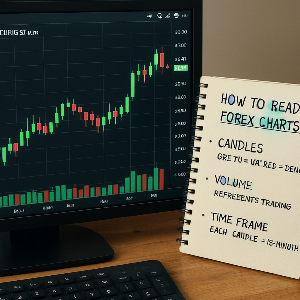
Next, focus on the candle shape. A green (or white) candle means the market closed higher than it opened, while a red (or black) candle shows the opposite. Spotting a series of green candles can hint at short‑term buying pressure, and a string of reds might signal sellers taking control. It’s the same visual cue we use in our How to Read Forex Charts guide, where we break down each candle component – body, wick, and shadow – in plain language.
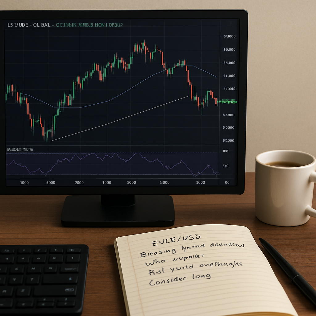
Real‑world example: imagine you’re watching the EUR/USD pair during the London session. You notice a bullish engulfing pattern forming – the second candle completely swallows the first. That pattern often precedes a modest upward move, especially if it appears near a known support level. Traders like you and me use this cue to plan a tentative entry, always remembering to set a stop‑loss just below the recent low.
Now, let’s talk about volume. While forex doesn’t have a centralized exchange, many platforms provide tick volume – a proxy for activity. Higher volume on an up‑move can add confidence that the trend has momentum. Conversely, a sharp drop in volume might warn that a rally is losing steam.
Finally, remember to keep a notebook. Jot down what you see: “Three green candles at 1.0800, low volume – possible reversal?” Over time, you’ll start spotting patterns that feel familiar, turning the chart from a mystery into a conversation you understand.
So, what’s the first thing you can do right now? Open a free demo account, pull up a 15‑minute chart of a major pair, and identify the last three candles. Note their colors, lengths, and any wicks. That tiny exercise is the first step toward mastering how to read forex charts.
TL;DR
Understanding how to read forex charts turns confusing price squiggles into clear signals you can act on, whether you’re an aspiring trader or a seasoned analyst.
Grab a demo account, pull up a 15‑minute chart, spot the candle colors, lengths and volume cues, then jot your observations – a simple habit that builds chart‑reading confidence day by day.
Step 1: Understand Forex Chart Basics
Now that you’ve seen the big picture, let’s dig into the very first building block: what the chart actually shows.
The vertical line on the left is the price axis. It tells you how high or low a pair is trading at any moment. The horizontal line at the bottom is the time axis – each tick could be a minute, five minutes, an hour, or a day depending on the frame you’ve chosen. If you can tell which way the price line moves as time slides forward, you already have a foothold.
Next up: the candles. A green (or white) candle means the market closed higher than it opened – think of it as a little “up‑vote” from buyers. A red (or black) candle shows the opposite, a “down‑vote” from sellers. The body of the candle is the distance between open and close; the wicks (or shadows) are the extremes the price touched during that period. When you see a long wick on the top of a red candle, it’s like the market tried to push higher but got pulled back.
Spotting patterns is where the fun begins. A bullish engulfing pattern, for example, appears when a small red candle is completely swallowed by a larger green one. That tells you buyers have taken control, especially if it shows up near a known support level. Conversely, a series of three red candles with short lower wicks can hint that sellers are tightening the reins. Try to name the pattern you just saw – naming forces the brain to notice the details.
While you’re watching the video, keep a simple notebook or a digital note open. Write down the time, the pair, the candle colors, and any wicks that stick out. Over a few days you’ll start seeing repetition, and that repetition is the language the market uses to talk to you.
Volume is the next clue. Forex doesn’t have a centralized exchange, so most platforms give you tick volume – a count of how many price changes occurred in that candle. Higher tick volume on an up‑move usually adds confidence that the move has momentum. If volume drops while price climbs, it could be a warning sign that the rally is losing steam.
Staying focused while you scan charts can be surprisingly hard. One trick that works for many traders is to set a short timer for each analysis session – say five or ten minutes – and then take a break. Using timers to stay focused helps keep your mind sharp and prevents you from drifting into endless scrolling.
Don’t forget the legal side of things. Even though you’re just practicing on a demo account, it’s worth knowing the basics of what regulations apply to forex traders in your region. A quick read at legal considerations for forex traders can save you a lot of headaches later.
If you ever feel stuck, it never hurts to seek a second opinion from someone who’s spent years studying market psychology. Insights from Dr. Brian Edwards often blend the technical with the behavioural, reminding us that charts are a reflection of human emotion as much as numbers.
Finally, picture this: you open a 15‑minute chart of EUR/USD during the London session, spot a green candle with a long upper wick, note the tick volume is high, and jot it down. In a few weeks you’ll start recognizing that this combination often precedes a short‑term bounce. That habit – watching, noting, and reflecting – turns a confusing screen into a conversation you understand.

Step 2: Identify Timeframes & Chart Types
When you first opened that 15‑minute EUR/USD chart you probably wondered whether you were looking at the right slice of time or the right kind of picture. That feeling is normal – the market gives you dozens of timeframes and a handful of chart styles, and picking the ones that actually tell you something useful is a skill in itself.
So, what should you focus on? First, ask yourself what you want to see. Are you trying to spot a short‑term swing that could last an hour, or are you mapping the broader trend that stretches over weeks? Your answer will point you toward a specific timeframe and a chart type that highlights the information you need.
Choosing the right timeframe
Think of timeframes like lenses on a camera. A 5‑minute lens zooms in on the tiny movements that happen during a news release, while a daily lens pulls back to show you whether the pair is generally climbing or falling. Most beginners start with a higher‑timeframe – daily or 4‑hour – to get the market’s overall direction, then drop down to 15‑minute or 1‑hour for entry details.
Here’s a quick three‑step routine you can try right now:
- Open a daily chart of EUR/USD. Note the slope – is it up, down, or flat?
- Switch to a 4‑hour chart. Look for any pull‑backs that respect the daily trend.
- Zoom into a 15‑minute chart. Identify the last three candles, their colour and volume.
If the daily trend is up and the 15‑minute candles are also green with rising volume, you have a confluence that many traders find comforting.
Understanding the main chart types
There are four common chart styles you’ll run into: line, bar (also called OHLC), candlestick and Heikin‑Ashi. Each one tells the same price story, but they do it with a different level of detail.
Line charts only connect closing prices. They’re great for a quick “big picture” view, but you miss the highs and lows that often signal a reversal.
Bar charts show the open, high, low and close for each period. The vertical line is the range, and the short horizontal ticks on the left and right are the open and close. If you’re comfortable reading raw numbers, bars give you the full picture without any colour bias.
Candlestick charts are basically coloured bar charts. A green (or white) body means the close is higher than the open, a red (or black) body means the opposite. The length of the wicks tells you how far price was pushed before settling back, which is why many traders prefer candlesticks for pattern spotting.
Heikin‑Ashi smooths out the noise by averaging the open and close. The result is a chart that looks less “jagged,” making it easier to see the underlying trend, but you lose the exact price levels.
If you’re not sure which to start with, the consensus among educators – including BabyPips – is to begin with candlesticks because they combine clarity with visual cues that are easy to interpret learn more about chart types.
Actionable checklist for today
- Pick a pair you like – EUR/USD, GBP/JPY, anything you can access on your demo.
- Open the daily chart and write down the trend direction.
- Switch to a 4‑hour chart, note any recent swing highs or lows.
- Zoom into a 15‑minute candlestick chart, count the last three candles, colour, body length, and volume.
- Compare what you see across the three timeframes. Do they all point the same way? If not, ask yourself why.
Doing this three‑timeframe drill every morning trains your brain to recognise which signals are consistent and which are just noise.
Pro tip: combine timeframe with chart type
When you’re looking at a daily chart, a line view can be enough to confirm the trend. Drop to a 1‑hour candlestick view when you need entry precision, and use a bar chart on the 4‑hour level if you want to see exact price ranges without the colour bias.
Remember, the goal isn’t to collect every possible chart – it’s to pick the one that gives you the clearest answer to the question you’re asking right now.
Quick comparison table
| Chart Type | Best Use | Typical Timeframe |
|---|---|---|
| Line | Identify long‑term trend direction | Daily, Weekly |
| Bar (OHLC) | Spot exact high/low and range | 4‑hour, 1‑hour |
| Candlestick | Pattern recognition and entry timing | 15‑minute, 1‑hour |
Take a minute now to open those three charts side by side. Jot down what each one is telling you, and you’ll start to see the market’s story unfold in colour, shape, and time.
Step 3: Recognize Price Patterns & Trendlines
Alright, you’ve got your three‑timeframe layout open – daily, 4‑hour, 15‑minute – and you know which candles are green or red. The next question is: what story are those candles actually telling? That’s where price patterns and trendlines step in.
Spotting the most common patterns
Think of a pattern as a shortcut your brain can use to recognise a familiar shape. The classic ones – like double tops, head‑and‑shoulders, or simple bullish engulfing – appear over and over because traders collectively react to them.
Here’s a quick “what‑to‑look‑for” cheat sheet you can paste into your notebook:
- Double top: two peaks at roughly the same level, separated by a trough. Usually signals a reversal from up to down.
- Double bottom: mirror of the double top, pointing to a bounce.
- Head‑and‑shoulders: a higher middle peak (the head) flanked by two lower peaks (the shoulders). Often a bearish reversal.
- Ascending triangle: a flat upper line with rising lower lows – a bullish continuation pattern.
When you see any of these on your 15‑minute chart, pause and ask: does the same shape show up on the 4‑hour view? If it does, the signal gets a lot stronger.
Drawing reliable trendlines
Trendlines are basically the backbone of price‑action analysis. A simple line that connects two or more swing highs or swing lows can instantly show you whether the market is climbing, sliding, or stuck in a range.
Babypips explains how to draw trendlines breaks it down nicely: you need at least two points to draw a line, but three points to feel confident it’s not a fluke. The steeper the line, the easier it is to break, so watch out for overly aggressive angles.
Here’s a step‑by‑step routine you can try right now:
- Zoom out to a 4‑hour chart and locate two clear swing lows. Draw a line along the bottoms – that’s your uptrend line.
- Switch to the 15‑minute chart. Does price respect that line? Count how many times it has bounced off it on a higher‑timeframe. The more touches, the stronger the line.
- If the line is being tested and price starts to close below it on a higher‑timeframe, that could be a warning sign – maybe the uptrend is weakening.
- Do the same for a downtrend line by connecting two swing highs. Again, look for repeated tests.
And a quick tip: don’t force the line to fit. If it looks crooked, it probably isn’t a valid trendline. Babypips reminds us that “if it does not fit right, then that trend line isn’t a valid one.”
Combining patterns with trendlines
Now the magic happens when a pattern and a trendline converge. Imagine you’ve drawn an uptrend line on EUR/USD and, on the 15‑minute chart, a bullish engulfing candle pops right at the line’s edge. That confluence is a strong hint that the market may keep climbing.
Conversely, a double top forming right on a descending trend line is a double‑negative signal – the price is trying to break higher but the trend is pushing it back.
For aspiring traders, this is a practical checklist:
- Identify a clear trendline on the higher timeframe.
- Scan the lower‑timeframe for classic patterns that sit near the line.
- Check tick volume – rising volume adds confidence to the pattern.
- Write a brief note: “Bullish engulfing at uptrend line, volume up – consider a tentative long if price holds above the line.”
Remember, patterns aren’t guarantees; they’re probabilities. Treat them as clues, not commandments.
Quick habit to lock it in
Every morning, after you’ve done the three‑timeframe drill, spend two minutes drawing the latest trendlines and spotting any fresh patterns. Over a week you’ll start seeing the same shapes pop up again and again, and your intuition will get sharper.
That’s the essence of recognizing price patterns and trendlines – a blend of visual observation, a pinch of geometry, and a dash of patience.
Step 4: Use Indicators for Confirmation
Alright, you’ve already spotted a pattern and drawn a trendline – now you need that extra nudge that says, “yeah, this feels right.” That’s where indicators step in. Think of them as a second pair of eyes that can confirm (or question) what your chart is whispering.
Why indicators matter
When you’re learning how to read forex charts, the visual cues alone can sometimes feel ambiguous, especially on a fast‑moving 15‑minute screen. An indicator translates price history into a simple line or colour, letting you see momentum, strength, or possible reversal without squinting at every candle.
Does a bullish engulfing candle near an uptrend line really have the backing of upward momentum? Or is the market simply wobbling? A quick glance at an indicator can answer that for you.
Choosing a simple indicator
If you’re just adding your first tool, keep it simple. The moving average is the go‑to because it smooths price over a set number of periods, showing you the prevailing direction without the noise.
Here’s a quick way to set it up:
- Open your 15‑minute chart.
- Add a 20‑period simple moving average (SMA). You’ll see a gentle line that lags the price just enough to filter out spikes.
- If the price is above the SMA and the SMA is sloping upward, you’ve got a bullish bias.
- If the price dips below the SMA while the line is still rising, that could be an early warning that the uptrend is losing steam.
Another beginner‑friendly tool is the Relative Strength Index (RSI). When the RSI climbs above 70, the market may be overbought; below 30, it could be oversold. Pairing RSI with your trendline helps you decide whether a pattern is likely to fire or fizzle.
Combining indicators with your pattern‑trendline combo
Let’s walk through a real‑world example. You’ve drawn an uptrend line on EUR/USD and you see a bullish engulfing candle sitting right on that line. Before you jump in, check the 20‑period SMA:
- If the SMA is also angled upward and the price is comfortably above it, you have three layers of confirmation – pattern, trendline, and momentum.
- If the SMA is flat or starting to tilt down, treat the pattern as a warning sign rather than a green light.
Now throw in the RSI. If it’s sitting around 55‑60, the market still has room to rise. If it’s already nudging 75, you might expect a short‑term pull‑back even though the pattern looks tasty.
By layering these signals, you turn a single visual clue into a small decision‑making framework that feels far less guess‑work.
Quick checklist for indicator confirmation
Every time you spot a pattern, run through this three‑step habit. It only takes a few seconds, but it adds a lot of confidence.
- Is the price above a short‑term moving average that’s sloping in the same direction as your trendline?
- What does the RSI say about overbought/oversold conditions?
- Do both signals line up with the pattern’s implied direction? If yes, note “high confidence”; if not, note “low confidence – watch for exit.
Write a quick note in your trading journal: “Bullish engulfing on uptrend line, price > 20‑SMA, RSI 58 – high confidence long.” This tiny habit makes the abstract feel concrete.
Remember, indicators are not magic wands. They’re just tools that help you filter noise. If the market decides to behave oddly, you’ll still be safe because you’ve already built a layered view of the price action.
So, the next time you sit down with your charts, let the moving average and RSI be your backstage crew – they’ll keep the lights on, but you still get to call the show.
Step 5: Practice Reading Charts with Real Data
Now that you’ve learned the basics, it’s time to move from theory to the messy, real‑world data that lives on your screen. Think of it like learning to drive: you can read the manual forever, but you won’t feel confident until you actually sit behind the wheel and press the pedals.
Pick a recent market slice
Start with a currency pair you already watch – EUR/USD is a solid choice because it’s liquid and has plenty of historical data. Open a 15‑minute chart and scroll back to a day that had clear news influence, like the ECB rate announcement on 15 March 2026. That day gives you both a trend and a few obvious turning points to dissect.
Why a specific date? Real data forces you to wrestle with the noise, the spikes, and the moments when the market seems to shrug off your expectations. It also lets you compare your notes with what actually happened later.
Step‑by‑step practice routine
- Identify the dominant trend on the daily chart. Is it up, down, or ranging? Write a one‑sentence summary in your journal.
- Zoom into the 15‑minute chart for that same day. Mark the first three bullish candles after the ECB announcement.
- Check the 20‑period SMA and RSI at the close of each candle. Note whether price sits above the SMA and whether RSI is between 40‑60.
- Draw a trendline that connects the low of the first candle to the low of the third. See if price respects that line for the next two candles.
- Record a concise observation: “Price > SMA, RSI 52, bullish engulfing on uptrend line – moderate confidence.”
Do this for at least three different days – one with a clear uptrend, one with a downtrend, and one sideways session. The repetition builds a mental checklist that you can run in seconds when you’re in front of a live chart.
Real‑world example
On 15 March 2026, the EUR/USD daily chart was gently climbing. When the ECB surprise cut the key rate, the 15‑minute chart showed a bullish engulfing candle at 1.0825, right on an uptrend line you’d drawn earlier. The SMA was sloping upward, and the RSI hovered at 55. Your note would read something like: “Bullish engulfing at 1.0825, price > 20‑SMA, RSI 55 – high confidence long.”
A few candles later, volume ticked up, confirming the momentum. If you’d stuck to the routine, you’d have a clear, documented rationale for why the price movement felt credible.
What to do when the signal fizzles
Sometimes the pattern looks perfect but the market reverses abruptly. That’s where your checklist saves you. If the price dips below the SMA while the RSI spikes above 70, tag the entry as “low confidence – watch for exit.” Then set a mental stop or a small paper‑trade to see how often the signal holds.
After you finish the exercise, go back to the daily chart and ask: did the short‑term move align with the larger trend? If not, note the discrepancy. Over time you’ll start to see which time‑frame combos produce the most reliable signals for the pairs you trade.
Quick cheat sheet you can paste into your journal
- Trend direction (daily): up / down / range
- Key candle pattern on 15‑min: engulfing / pin bar / doji
- SMA position: price above or below
- RSI band: 30‑70 neutral, >70 overbought, <30 oversold
- Volume cue: rising / falling
- Confidence level: high / moderate / low
Keep this list handy – you’ll find yourself filling it in almost automatically after a few practice sessions.
Want a visual walkthrough of a similar live analysis? Check out this short video that walks through the exact steps on a recent EUR/JPY chart: real‑time chart practice video. Watching someone else apply the same routine reinforces the habit and highlights the little things you might miss when you’re working solo.
Finally, give yourself a tiny deadline. “I will complete three full‑day analyses by next Friday.” Treat it like a mini‑project, not a vague suggestion. When you hit that target, you’ll notice a shift – the charts start to feel less like abstract art and more like a conversation you’ve been part of for weeks.
Conclusion
By now you’ve turned a wall of squiggles into a conversation you can actually follow. Learning how to read forex charts isn’t magic; it’s a habit you build one candle at a time.
We’ve covered the basics – price axis, candle anatomy, time‑frame selection, pattern spotting, trendlines and the simple confirmation tools like a 20‑period SMA and RSI. Each piece fits together like a puzzle, giving you confidence to spot a bullish engulfing or a double top and decide whether the market is speaking in agreement or contradiction.
So, what’s the next step? Grab a demo account, pull up a 15‑minute chart of your favourite pair, and run through the quick checklist we built – trend, candle pattern, SMA position, RSI band and volume cue. Jot a one‑line note and see how quickly the routine becomes second nature.
Make it a daily habit – even two minutes before you check the news. Consistency beats occasional deep dives, because the brain starts recognising the same shapes without you having to think about it. Over a week you’ll notice the market’s story flowing more clearly.
Keep the momentum going by revisiting the steps whenever a new pattern pops up, and consider diving deeper into our more advanced guides at FX Doctor when you’re ready. The more you practice, the easier it becomes to read forex charts as a natural part of your trading routine.
FAQ
What is the best way to start learning how to read forex charts?
Begin with a single time‑frame and a simple candlestick chart. Open a 15‑minute EUR/USD view, spot the last three candles, note their colour, body length and wicks. Then add a 20‑period SMA and glance at the tick‑volume bar. This tiny routine gives you a concrete picture without overwhelming detail.
From there, repeat the same steps every day. Consistency trains your eye to recognise patterns instinctively, and the habit becomes a low‑effort warm‑up before you even glance at the news.
How often should I review my chart notes?
Ideally you glance at them at the end of each trading session. A quick five‑minute recap lets you see whether the patterns you flagged held up, and it highlights any mismatches between your expectation and the market’s actual move.
If you’re juggling a full‑time job, set a reminder for the same time each evening. The routine creates a feedback loop that sharpens your interpretation skills over weeks.
Do I need complex indicators to understand price action?
No. Price action lives in the candles themselves. A bullish engulfing, a pin bar, or a simple trendline often tells you more than a dozen moving averages piled on top of each other.
Start with a 20‑period SMA and the RSI for basic confirmation, then gradually experiment only if the extra data actually clears up uncertainty. Less clutter means clearer decisions.
What time‑frame is most useful for beginners?
Most traders find the 15‑minute chart a sweet spot. It’s short enough to see multiple candles in a single session, yet long enough to filter out the micro‑spikes that dominate a 1‑minute view.
Pair it with a higher‑timeframe – like the daily – to confirm the overall trend. If both frames point the same way, you’ve got a solid base for your next trade idea.
How can I avoid analysis paralysis when reading charts?
Limit yourself to three core signals: candle pattern, SMA position and one momentum gauge like RSI. When all three line up, you have a clear entry cue; if they don’t, step back and wait.
Write a one‑line note after each review – something like “bullish engulfing, price > SMA, RSI neutral”. The note forces you to summarise quickly and prevents endless tweaking.
What should I do if a pattern fails after I entered a trade?
First, check the confirmation tools you used. If the price fell below the SMA or the RSI jumped into overbought territory, treat the move as a warning sign and consider tightening your stop‑loss.
Second, write a brief post‑trade note describing what went wrong. Over time those notes become a personal database that helps you spot recurring pitfalls and refine your entry checklist.