
Imagine you’re sitting at a kitchen table, a laptop open, and the EUR/USD chart flashing on the screen. You see the price swing up, then down, then up again. You wonder why it moves that way and how you can tell if the next move will be higher or lower. That tiny question is the heart of forex market structure explained. It’s the first step any new trader takes before they even think about risk or money management. If you can read the market’s shape, you’ll know where to look for trades, where to set stops, and when to stay out. In this guide we’ll walk through the whole picture—what makes the forex market tick, how to spot its phases, how to find swing highs and lows, and how to use several timeframes together. By the end you’ll have a clear map you can apply on any pair, any session, any day.
Understanding Forex Market Structure Fundamentals
Let’s start with the big idea: forex market structure explained means knowing who trades, how they trade, and what price quotes represent. The foreign exchange market is a global, decentralized place where banks, hedge funds, corporations, and individual traders swap currencies. It moves more than $7 trillion a day, far bigger than any stock market. Because there’s no single exchange, dozens of dealers post their own rates at the same time. This competition pushes the price to the best possible level for you.
At the top of the ladder sits the interbank market. Here the world’s biggest banks trade millions or billions of dollars directly with each other or through electronic brokers like EBS and Reuters. Those brokers run central limit order books that act as the main source of price discovery for the whole FX spot market. For example, EUR/USD is most liquid on EBS, while GBP/USD sees tighter quotes on Reuters. When a bank needs a rate, it looks at the best quote from these platforms, then trades at that price if it meets its credit terms.
Below the interbank tier come hedge funds, corporations, and retail market makers. They don’t have the same credit lines, so they go through commercial banks and pay slightly higher spreads. Finally, at the bottom, are retail traders like you and me, who access the market through online brokers. Thanks to the internet, the barriers that once kept “little people” out have dropped. You can now trade a mini‑lot with just a few hundred dollars of capital.
Understanding this hierarchy helps you see why some quotes are tighter than others, why liquidity can dry up at odd hours, and why price can jump sharply when a big bank steps in. That’s the core of forex market structure explained.
For a deeper look at how price action fits into this hierarchy, check out A Practical Guide to Forex Price Action Trading. It walks you through the same ideas with real‑world chart examples.
External sources that back up these points include Babypips’ overview of forex market structure and the same site’s detailed ladder diagram, which shows the flow from interbank to retail.
And if you want to see how technology shapes the market, you might read How to Choose and Use an AI SEO Audit Tool in 2026. While it’s about SEO, the article explains how tools can automate data collection—much like the platforms that feed forex price feeds.
Step 1: Identify Market Phases – Accumulation, Trend, Distribution
Every price chart goes through three basic phases. First comes accumulation, where smart money gathers positions quietly. The price range is tight, and you’ll see small candles, low volume, and a lot of indecision. Next is the trend phase. Here the market breaks out of the range and moves in one direction, often with larger candles and higher volume. Finally, distribution appears when the big players start to unload their positions, causing a new range to form.
Spotting these phases is the first piece of forex market structure explained that you can actually use. When you see a tight range after a long move, think “accumulation”. When the price bursts out with momentum, think “trend”. When the move stalls and candles start to shrink, think “distribution”.
Here’s a quick checklist to label a phase:
- Range width: less than 0.5% of the pair’s daily range = accumulation.
- Breakout size: more than 1% move in 2‑3 candles = trend.
- Volume change: rising volume on breakout, falling volume on distribution.
- Sentiment cues: news calm during accumulation, hype during trend.
Why does this matter? Because each phase suggests a different trading approach. In accumulation you might look for reversal patterns; in trend you follow the direction; in distribution you may tighten stops or look for a counter‑trend move.
Now watch this short video that shows a real chart moving through the three phases. It helps you see the swing points in action.
To keep the picture clear, remember that the phases repeat. After a distribution range, a new trend can start in the opposite direction, and the cycle begins again. That loop is a core idea in forex market structure explained.
For more on how social platforms schedule content, you can explore Best Social Media Scheduling Software for Marketers in 2026. The scheduling logic mirrors how traders schedule entries and exits.
And if you need a quick tip on photo booth rentals for a celebration, see Photo Booth Rental for Graduation Party: A Step‑by‑Step Guide. It’s not about trading, but it shows how to plan a timeline—just like you plan a trade.
Step 2: Spot Swing Highs and Lows – Comparison Table
Swing points are the peaks and valleys that mark the end of one mini‑trend and the start of another. In forex market structure explained, swing highs form the top of a range, swing lows the bottom. Spotting them lets you draw support and resistance lines that act as future trade triggers.
There are two main ways to find swing points:
- Visual inspection: look for a candle that has a higher high than the two candles before and after it.
- Indicator aid: use a simple moving average or a swing high/low indicator that flags these points automatically.
Below is a table that compares the two approaches. It shows the pros, cons, and a quick tip for each.
| Method | Pros | Cons | Quick Tip |
|---|---|---|---|
| Visual Inspection | Free, teaches you chart reading. | Subjective, slower on fast markets. | Zoom in to the 4‑hour chart for clear peaks. |
| Indicator Aid | Consistent, works on any timeframe. | May lag, needs proper settings. | Set the swing length to 5 bars on a 1‑hour chart. |
Why does this help? When you connect swing highs, you get a descending resistance line; connect swing lows for an ascending support line. Those lines guide where price may bounce or break.
And if you’re curious about how automation can help you spot these points faster, read Best Social Media Automation Tools for 2026: Boost Your Workflow. The same logic applies to trading bots that flag swing highs.
Need a visual cue for a party? Check out How to Choose the Perfect Prom Photo Booth Rental for an Unforgettable Night. Picking the right angle there is like picking the right swing point on a chart.
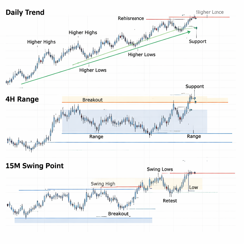
Step 3: Apply Structure Across Multiple Timeframes
One chart alone can’t tell the whole story. That’s why forex market structure explained often uses multiple timeframes. Think of it like looking at a city map and a street map at the same time. The city map shows the big trend, the street map shows the exact turn you need to take.
Here’s a step‑by‑step guide to multi‑timeframe analysis:
- Pick a higher timeframe (like the daily chart) to spot the overall trend. Is it up, down, or flat?
- Switch to a medium timeframe (like the 4‑hour chart) to find the current phase—accumulation, trend, or distribution.
- Zoom into a lower timeframe (like the 15‑minute chart) to locate precise swing highs, swing lows, and entry points.
- Make sure the swing points on the lower chart respect the zones drawn on the higher chart. If they break, the higher trend may be changing.
- Place your stop loss just beyond the swing point that contradicts your trade direction. This ties risk to structure.
Why use this method? Because price can look chaotic on a short chart but align perfectly with a larger trend when you step back. That alignment is a key signal in forex market structure explained.
Here’s an example. On the daily EUR/USD chart you see a clear uptrend with higher highs and higher lows. On the 4‑hour chart you notice a short range forming—an accumulation phase. On the 15‑minute chart you spot a bullish swing low at the bottom of that range. That low becomes a solid entry point, with the daily uptrend acting as your bias.
To visualize this, imagine a layered image where each timeframe is a transparent sheet. The top sheet shows the big trend line, the middle sheet shows the range, and the bottom sheet shows the exact swing point you’ll trade.
For more on picking the right tools, you might read How to Choose and Use an AI Video Script Generator for Faster Production. It explains how to pick software that works across layers, just like you pick charts that work together.
And if you ever need a tip on renting a mirror photo booth for an event, see Mirror Photo Booth Rental: 7 Must‑Know Tips for an Unforgettable Event. Choosing the right angle there is just like picking the right timeframe for a trade.
Conclusion
We’ve walked through the whole picture of forex market structure explained. First, we broke down who trades and why the market has no single price. Next, we learned to name the three phases—accumulation, trend, distribution—and why each calls for a different approach. Then we saw how to spot swing highs and lows, and we compared visual and indicator methods. Finally, we put it all together with a multi‑timeframe workflow that lets you trade with confidence.
Remember: the market’s shape is the map; your strategy is the route. Use the map to pick entry zones, set stops, and stay out when the structure tells you to. Keep practicing on a demo account until the steps feel natural. When you’re ready, you can move on to risk management and psychology, but the foundation you just built will stay with you for every trade.
If you found this guide helpful, explore more at Forex Education: A Complete Resource Hub for 2026. Keep learning, keep charting, and keep trading smart.
FAQ
What is the main purpose of learning forex market structure?
Understanding forex market structure explained helps you see the market’s hidden order. It shows where price is likely to turn, where it may continue, and how to set logical stop‑loss levels. By reading the structure you avoid guessing, reduce random entries, and improve consistency. The skill works on any pair, any session, and any timeframe, making it a core tool for any trader.
How do I identify an accumulation phase on a chart?
Look for a tight range where the high‑low spread stays under about half a percent of the daily range. Candles are small, volume is flat, and price bounces between the same support and resistance levels. When you see these signs, you’re likely in accumulation, which means the market is gathering strength for a possible breakout.
When should I use a swing‑high indicator instead of drawing by eye?
Use an indicator if you trade many pairs or need quick alerts. It removes subjectivity and works on any timeframe. However, it may lag a few bars, so double‑check with visual confirmation before you act. Many traders start with visual drawing, then add the indicator for confirmation as they gain speed.
Can I apply multi‑timeframe analysis to crypto pairs?
Yes. The same steps—identify the higher‑timeframe trend, find the medium‑timeframe phase, then locate the lower‑timeframe swing point—work for crypto as they also trade 24/7. The only tweak is that crypto can have higher volatility, so you may want tighter stop‑losses and a bit more caution.
What are the biggest mistakes beginners make with market structure?
One mistake is mixing phases—trying to trade a trend when the market is actually in distribution. Another is ignoring higher‑timeframe bias, which can lead to fighting the larger trend. Finally, many new traders set stops too tight, not giving the structure enough room to breathe. Fix these by always checking three timeframes and respecting swing zones.
How often should I reassess the market structure during a trading day?
Reassess whenever a new candle forms on your primary timeframe. On a 1‑hour chart, that means checking at the top of each hour. If you trade shorter frames, like the 15‑minute, you may want to look every four candles. The goal is to catch any shift from accumulation to trend or from trend to distribution as soon as possible.
Is it safe to trade only during the trend phase?
Trading only in trend can boost win rates, but it also means you may miss setups that form in accumulation or distribution. Those phases often provide high‑reward reversal trades. A balanced plan uses all phases—trend for momentum trades, accumulation for breakout entries, and distribution for exit or reversal spots.
Do news events affect market structure?
News can spark a sudden shift from accumulation to trend or from trend to distribution. A major data release may break a tight range and start a strong move. That’s why it’s wise to check an economic calendar and note any upcoming events before you lock in a trade based on structure alone.