
Forex traders who stare at busy screens lose the edge. A clean chart lets you see the market’s true story. In this guide you’ll learn how to read forex price action charts from the ground up. We’ll walk through price action basics, key candlestick patterns, support and resistance, market structure, and how to use multiple timeframes for confirmation. By the end you’ll have a clear checklist you can apply to any pair.
Step 1: Understand What Price Action Is
Price action is simply the movement of price on a chart. It shows every trade that has happened, without any extra fluff. When you strip away indicators you see the raw decisions of buyers and sellers.
Why does this matter? Because every news item, every economic release, every trader’s emotion ends up as a price bar. If you can read those bars you can react to the market in real time.
Most beginners start with “messy” charts that have dozens of indicators. The data we pulled from a leading education site shows that cluttered charts cut the viewable area and pull focus away from the raw price. That single mistake shows up in only 3% of price‑action checklists, yet it costs many new traders their edge.
Here’s what I mean. Take a EUR/USD chart with MACD, Bollinger Bands and several moving averages. The price bars get squeezed, the eye jumps to the lower pane, and the true trend can be missed. A clean chart keeps the whole price story on one screen.
To start, set your platform to a simple candlestick view. Turn off all studies except maybe a single moving average to help spot the trend direction. Then draw the most recent swing high and swing low. Those two points give you a quick sense of whether the market is trending or consolidating.
When you look at the chart you’ll see higher highs and higher lows in an uptrend, lower highs and lower lows in a downtrend, or a flat range when the market is indecisive. Those patterns are the language of price action.
“The best way to know what the market is doing is to look at the price alone.”
Now that you know why a clean chart matters, you can move on to the patterns that give you entry clues.
Bottom line:Strip your chart to pure price bars and you’ll capture the market’s true intent.
Step 2: Recognize Key Candlestick Patterns
Candlesticks are like tiny pictures of buyer and seller battles. Each candle has a body and wicks that tell you who was in control.
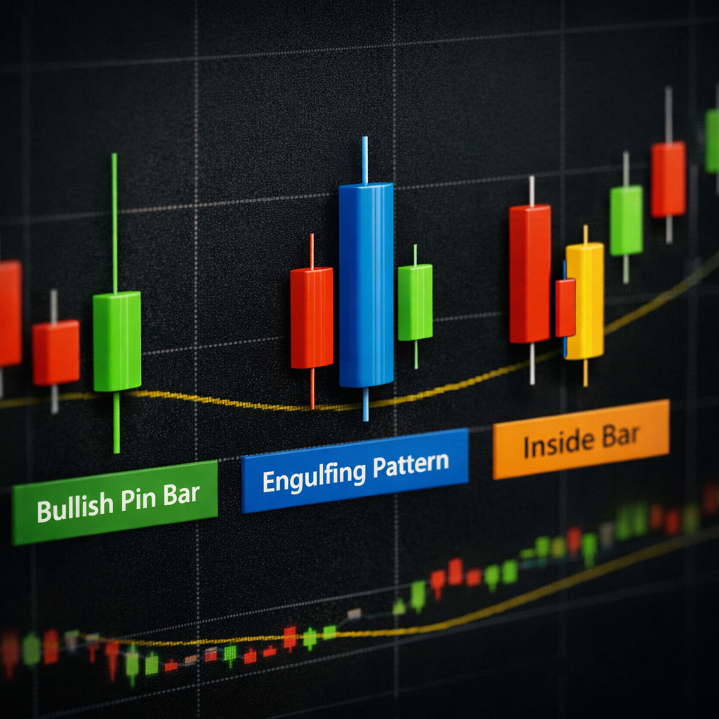
Eight patterns dominate most price‑action guides: Pin Bar, Inside Bar, Bullish Engulfing, Bearish Engulfing, Breakout & Retest, and the classic trend‑continuation bars. Learning these gives you a language you can use on any pair.
Let’s look at the Pin Bar first. A Pin Bar has a long wick that pokes out of a short body. The wick shows where price was rejected. If the long wick sits below the body and the candle closes near the top, it’s a bullish Pin Bar , a sign of a possible reversal up.
Next, the Engulfing patterns. A Bullish Engulfing happens when a small red candle is followed by a larger green candle that completely covers the first’s body. That shows buyers took over the market.
The Inside Bar is a candle that sits completely inside the previous candle’s range. It signals a pause and often leads to a breakout when price finally moves out of that range.
Here’s a quick reference table you can print out and stick to your monitor.
| Pattern | Visual Cue | Typical Use |
|---|---|---|
| Pin Bar | Long tail, small body | Reversal at support/resistance |
| Inside Bar | Inside previous range | Breakout entry |
| Bullish Engulfing | Green body covers red body | Trend continuation up |
| Bearish Engulfing | Red body covers green body | Trend continuation down |
| Breakout | Close beyond prior high/low | Start of new move |
| Retest | Price returns to breakout level | Confirmation entry |
Why do these matter? Because each pattern forms at a key level , a swing high, swing low, or a trend line. When you see a Pin Bar at a recent low, you have a high‑probability chance of a bounce.
To practice, open a demo account and scroll through a week of 1‑hour EUR/USD candles. Mark each Pin Bar, Engulfing and Inside Bar you see. Count how many led to a move in the direction the pattern suggested.
Bottom line:Recognizing key candlesticks turns raw price into clear trade signals.
Step 3: Identify Support and Resistance Levels
Support is a price area where buyers tend to step in. Resistance is where sellers step in. When price hits these zones it often pauses or reverses.
To find them, look for places where price has bounced at least twice in the past. Draw a horizontal line across the highs for resistance, and across the lows for support.
Why are these levels important? Because they act like walls. If the market respects a wall, a breakout or a bounce can give you a strong entry.
After you plot the lines, watch how price reacts. If a bullish Pin Bar forms right at a support line, that’s a classic pull‑back entry. If price tears through a resistance line and closes above it, a breakout entry is likely.
For a deeper dive on how support and resistance work, see the Wikipedia entry on the topic.
Support and resistance on Wikipedia
Pro tip: Use the “price high‑low” tool in your platform to snap lines to the exact swing points. This saves time and keeps your chart tidy.
Bottom line:Identifying strong support and resistance lets you spot where price is likely to react.
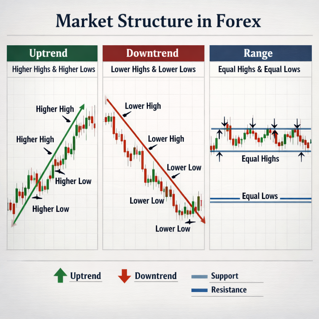
Step 4: Analyze Market Structure
Market structure is the overall shape of price over time. It tells you if the market is trending, ranging, or about to change.
Look for higher highs and higher lows , that’s an uptrend. Lower highs and lower lows signal a downtrend. When you see a series of equal highs and lows, the market is consolidating.
Why does structure matter? Because you want to trade with the trend. A common mistake is to jump into a counter‑trend trade too early. The research we reviewed shows many guides forget to warn about this error.
When the market is in a downtrend and pulls back to a recent swing high, a bearish Pin Bar that forms there can be a signal to re‑enter the downtrend. The same logic works in an uptrend.
Another useful idea is the “trend‑line break”. Draw a line connecting swing lows in an uptrend. If price falls below that line, the trend may be ending.
“Trends are your friend, but only if you know when they end.”
To practice, pick a 4‑hour chart of GBP/JPY. Mark the swing highs and lows for the past two weeks. Note how many times the price respected those levels before moving on.
Bottom line:Analyzing structure tells you whether to trade with or against the market’s current direction.
Step 5: Combine Timeframes for Confirmation
Timeframes are like zoom levels on a map. A daily chart shows the big picture, while a 15‑minute chart shows the fine detail.
Start with a higher timeframe to spot the main trend. Then drop down to a lower timeframe to find the exact entry point.
For example, if the daily EUR/USD chart is in an uptrend, look for a pull‑back on the 1‑hour chart. When you see a bullish Pin Bar at a support zone on the 1‑hour chart, that’s a confirmed entry that aligns with the daily trend.
Why use multiple timeframes? Because a pattern on a low timeframe can be a false signal if the higher timeframe is showing a strong opposite trend. Combining them filters out the noise.
Here’s a step‑by‑step guide you can follow each day:
- Open the daily chart. Identify the trend (HH/HL or LH/LL).
- Switch to the 4‑hour chart. Mark the latest swing points.
- Drop to the 1‑hour chart. Look for a candlestick pattern at a marked level.
- Confirm the pattern with volume or a short‑term moving average if you like.
- Place your stop just beyond the swing low (for a buy) or swing high (for a sell).
Doing this each day builds a habit of checking the bigger picture first, then fine‑tuning your entry.
Bottom line:Use a higher timeframe for trend, a lower timeframe for entry, and you’ll trade with stronger probability.
Frequently Asked Questions
What is the main benefit of reading forex price action charts?
Reading forex price action charts lets you see the market’s pure intent without the noise of lagging indicators. You can spot trends, reversals and key levels directly from the price bars. This leads to faster decisions and a clearer trade plan, which is why many educators recommend a clean‑chart approach.
Do I need any indicators to read price action?
No. The whole idea of price action is to rely on raw price alone. Some traders add a single moving average to help see the trend, but that’s the only extra tool most experts suggest. All other signals come from the candles, support/resistance and market structure.
How often should I redraw support and resistance?
Redraw them whenever the market makes a clear new swing high or low. A good habit is to check them at the start of each trading session. This keeps your zones relevant and prevents you from trading off stale levels.
Can I use price action on any currency pair?
Yes. Price action works on major, minor and exotic pairs alike. The patterns are the same; only the volatility may differ. For less‑liquid pairs, give yourself a slightly wider stop to account for occasional spikes.
What timeframes work best for beginners?
Many educators say “any timeframe,” but a practical combo is daily for trend and 4‑hour for entry. This gives you enough data to see the big picture while still allowing decent trade frequency.
How do I avoid common mistakes when reading price action?
The biggest mistake is adding too many indicators. That shrinks the chart area and shifts focus away from raw price. Keep the chart clean, draw only key levels, and wait for a clear candlestick signal before you act.
Is price action suitable for day trading?
It can be. Day traders often use 15‑minute or 30‑minute charts to spot short‑term patterns, then confirm with the 4‑hour trend. The same principles of clean charts, support/resistance and candlestick signals still apply.
Where can I find more detailed examples?
FXDoctor offers a full guide that walks through real‑world charts step by step. You can also explore the A Practical Guide to Forex Price Action Trading for deeper case studies and worksheets.
Conclusion
Reading forex price action charts is about stripping away the clutter and listening to what the market is saying. You start with a clean chart, learn the key candlestick patterns, draw support and resistance, read the overall market structure, and then confirm your entry on a lower timeframe. Follow the checklist we built, practice on a demo account, and you’ll develop the eye that seasoned traders rely on.
FXDoctor is here to help you master each step with clear examples and free resources. Keep practicing, stay disciplined, and let the price guide your trades.