
Forex feels like a maze. You look at charts, see numbers, and wonder what to do. This forex technical analysis tutorial for beginners will cut the noise. You’ll walk through market structure, trend lines, support and resistance, simple indicators and how to test it all on a demo. By the end you’ll have a clear checklist you can use right away.
Step 1: Understand Market Structure and Price Action
First, get the lay of the land. The market moves in three basic phases: up, down, or sideways. When price makes higher highs and higher lows, the market is in an up‑trend. When it makes lower lows and lower highs, it’s a down‑trend. A flat range means no clear direction.
Look at each candle. A long body shows strong buying or selling. A short body means the market is unsure. A wick shows where price tried but failed to stay. By reading these parts you can see who’s in control.
Imagine a EUR/USD chart on a 1‑hour frame. You see a series of higher highs. That tells you buyers are winning. If a candle then closes below the previous low, the down‑move may be starting.
Why does this matter? Because price action is the base for every tool you’ll add later. If you misread the market’s shape, any indicator you add will give false hints.
When you start, keep a simple journal. Write down the trend, the candle shape and what you think will happen. Over time you’ll spot repeatable habits.
For a deeper dive on price patterns, check out the Forex Technical Analysis for Beginners guide on the FX Doctor site.
Bottom line:Know the basic up, down and sideways shapes and read each candle’s body and wick before you add any tools.
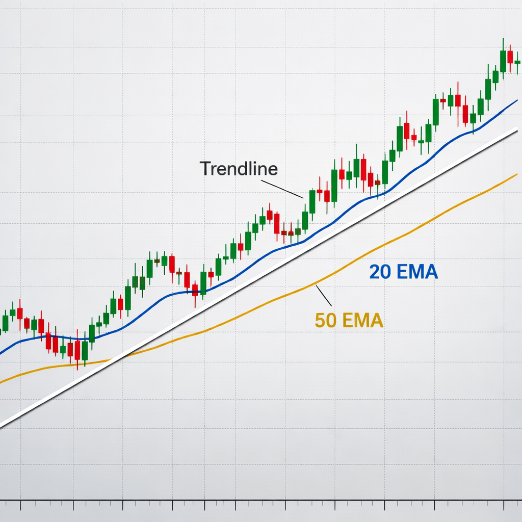
Step 2: Identify Trends with Trendlines and Moving Averages
Now that you see the market shape, draw a line that follows the direction. A trendline links two or more swing highs in a down market, or two or more swing lows in an up market. The line acts like a road that price tries to stay on.
To draw a good line, use at least three points. If the line breaks, the trend may be weakening. Many traders wait for a candle to close beyond the line before they act.
Moving averages smooth out the noise. The 20‑period EMA reacts fast, the 50‑period EMA reacts slower, and the 200‑period EMA shows the long‑term view. When the short EMA crosses above the long EMA, it can signal a new up‑trend. When it crosses below, it can signal a down‑trend.
Here’s a quick step‑by‑step:
- Open a chart on a 4‑hour time frame.
- Plot the 20‑EMA and 50‑EMA.
- Draw a trendline using the most recent lows if the market is up.
- Watch for a candle that closes above the trendline and the 20‑EMA crossing the 50‑EMA.
That combo gives a double check. The trendline shows the price path, the EMA crossover shows momentum.
According to the U.S. Commodity Futures Trading Commission, the forex market is the largest financial market in the world, handling over $6 trillion a day. Knowing the trend helps you stay on the right side of that huge flow.
When the market is choppy, you may switch to a longer time frame or use a slower EMA to avoid false signals.
Bottom line:Use trendlines to see direction and moving averages to confirm momentum before you trade.
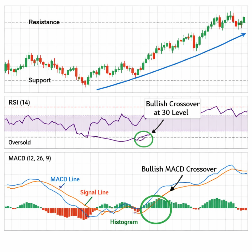
Step 3: Use Support and Resistance Levels Effectively
Support is a price area where buyers step in. Resistance is where sellers step in. When price hits a support level and bounces, you may look for a long entry. When it hits a resistance level and falls, you may look for a short.
How to find them? Look for places where price has turned at least two times. Draw a horizontal line at those points.
But don’t just draw any line. Make sure the line is near the candle wicks, not the bodies. Wicks show where the market tried to go but was pushed back.
Here’s a real‑world case. On a GBP/JPY daily chart, price fell to 150.30 three times in a month. Each time it bounced higher. You draw a support line at 150.30. When price later fell to that line again, a bullish candle closed above it. That gave a clear entry signal.
Combine the level with a confirming tool. For example, if the RSI is below 30 (oversold) at the support level, the bounce is stronger.
Remember the rule: price can break a level, test it again, then reverse. That second test often gives a cleaner entry.
And if the level fails, you can turn it into a new resistance for a short trade.
One more tip: mark the level on multiple time frames. If a level shows up on both 4‑hour and daily charts, it’s more reliable.
Bottom line:Draw horizontal lines at clear bounce points and wait for a candle to close beyond the level before you act.
Step 4: Apply Simple Indicators: RSI and MACD
Now add two easy tools. The Relative Strength Index (RSI) measures how fast price moved up or down. It ranges from 0 to 100. When RSI is above 70, the market may be overbought. Below 30, it may be oversold.
Read more about RSI on Wikipedia. The page explains the math and why traders watch the 70/30 zones.
The Moving Average Convergence Divergence (MACD) looks at two EMAs , usually 12‑period and 26‑period , and shows the gap between them. When the MACD line crosses above the signal line, it hints at upward momentum. When it crosses below, it hints at downward momentum.
Set up both on a 1‑hour chart. Look for these steps:
- Add a 14‑period RSI.
- Add MACD with default 12, 26, 9 settings.
- Watch for RSI at 30 while MACD crosses up , a double buy cue.
- Watch for RSI at 70 while MACD crosses down , a double sell cue.
Why use both? RSI tells you if the market is extreme. MACD tells you if momentum is shifting. Together they cut down on false moves.
Don’t rely on one signal alone. If price is also near a support line, the trade becomes even stronger.
Bottom line:Combine RSI’s overbought/oversold zones with MACD crossovers for clearer entry signals.
Step 5: Combine Indicators with Price Action Patterns
Alone, each tool can give false hints. Put them together and you get a stronger signal. This idea is called confluence. When two or more tools point to the same move, the chance of success rises.
Here’s a simple way to blend them:
- Find a clear price action pattern , a pin bar, engulfing candle, or inside bar.
- Check if the pattern sits on a support or resistance zone.
- Look at the RSI , is it in the oversold or overbought area?
- Confirm with MACD , does the line cross in the same direction?
If all four line up, you have a confluence zone. The market sees that zone as a strong signal and may move quickly.
Below is a quick checklist you can print.
When you see a bullish pin bar at a support line, RSI at 28, and MACD crossing up, the four tools agree. That’s a high‑probability long set‑up.
“Confluence reduces false signals and helps manage risk more efficiently.”
The research from LiteFinance explains that confluence tools filter each other’s signals and cut down on noise. It also warns that too many tools can cause chaos.
So stick to a handful of reliable tools. The four‑tool combo above works well for most beginners.
Bottom line:Look for zones where price patterns, levels, RSI and MACD all point the same way before you trade.
Step 6: Practice on a Demo Account Before Trading Live
All the steps above sound good on paper. The real test is to try them without risking cash. A demo account gives you fake money but real market data.
Here’s how to set it up:
- Choose a broker that offers a free demo.
- Set the account size to at least $10,000 so trade sizing feels realistic.
- Apply the checklist from Step 5 on each trade idea.
- Record the result , entry, stop, target, outcome.
- After 20 trades, review the win rate and average profit.
Use the video below to see a live demo walk‑through. It shows how to place the trendline, add RSI and MACD, and log the trade.
When you see a pattern that meets the confluence checklist, place a mock trade. If the trade hits your stop loss, note why , maybe the level was weak or the RSI was too close to 50.
After you’re comfortable, you can shrink the position size and move to a real account. Keep the same rules , never trade on impulse.
Bottom line:Use a demo account to test the whole system, log results, and only go live when the stats are solid.
Conclusion
Learning forex technical analysis is a step‑by‑step process. You start with market structure, add trendlines and moving averages, then layer support, resistance, RSI and MACD. The final piece is to blend those tools into a confluence zone and practice on a demo.
FX Doctor’s free tutorial brings all these parts together in one place. It’s the only guide that walks a beginner from candles to confluence without hype or promises.
Take the checklist, open a demo, and start logging each trade. With patience you’ll see which parts work best for you. Keep learning, keep testing, and you’ll build a solid foundation for future trading success.
Frequently Asked Questions
What is the best time frame for a forex technical analysis tutorial for beginners?
Most beginners start on the 1‑hour or 4‑hour chart. These frames show enough moves to spot trends but aren’t as noisy as a 5‑minute chart. Use the same frame for all tools , trendlines, moving averages, RSI and MACD , so the signals line up.
How do I know if a trendline is reliable?
A reliable trendline touches at least three swing points and stays unbroken for several candles. If price breaks the line and stays beyond it, the trend may be ending. Confirm with a moving‑average crossover or a confluence zone before you act.
Can I use RSI on a daily chart instead of an hourly chart?
Yes. RSI works on any time frame. On a daily chart, the 14‑period setting still marks overbought (above 70) and oversold (below 30) zones. Just remember that signals will be slower, giving you more time to plan each trade.
What should I set as my stop loss when I follow this forex technical analysis tutorial for beginners?
Place the stop just beyond the nearest support or resistance level that broke the entry candle. For example, if you buy at a bounce off a support line, set the stop a few pips below that line. This gives the trade room while limiting loss if the market reverses.
How many indicators should I combine with price action?
Start with two: one oscillator like RSI and one trend tool like MACD. Add support or resistance as the third. More than four tools can clutter the view and cause analysis paralysis.
Is a demo account enough to become a profitable trader?
A demo helps you learn the steps without risk, but it lacks the emotion of real money. Use the demo to perfect your checklist, then trade a small real account to add the psychological element. Keep the same rules you used in the demo.
How often should I review my trading journal?
Review your journal after every ten trades. Look for patterns in wins and losses , maybe you trade too early on a trendline break or ignore a weak RSI signal. Adjust your checklist based on what you see.
Do noise‑filtering charts like Renko replace candlesticks?
Renko, Point‑and‑Figure and Kagi charts remove small price moves, making trends clearer. They’re useful later when you’re comfortable with basics. Start with candlesticks, then experiment with these charts as you grow.