Getting the entry right can mean the difference between a solid win and a quick loss. Most traders focus on direction, but timing is the hidden lever that drives consistency. In this guide you’ll learn a step‑by‑step checklist that blends price‑action, session windows, and selective indicators so you can walk into each trade with confidence.
Step 1: Analyze Market Structure Before Entry
Start by looking at the big picture. Is the market making higher highs and higher lows, or is it carving lower lows and lower highs? Those swings tell you whether the overall bias is bullish or bearish. Luca Santos, a market analyst, notes that many traders miss the timing cue by only watching trend direction and ignore the wave‑like nature of price. He says the “difference between a winning and a losing trade isn’t always about choosing the right direction, it’s often about choosing the right moment to enter.” Read his full breakdown.
Identify the current market structure:
- Mark the last swing high and swing low on a 4‑hour chart.
- Check if the price is forming a higher low (bullish) or lower high (bearish).
- Note any break of the previous swing point , that’s a potential structure shift.
When you see a break, pause. The break can be a false alarm, especially in volatile news windows. Look for a confirming candle that closes beyond the broken level before you act.
Why this matters: A clear structure view filters out noise and narrows down the moments when price respects key levels. It also aligns with the research finding that half of proven entry‑timing rules rely on pure price‑action, not indicators.
Bottom line:Verify the market’s swing pattern and wait for a confirming candle before you think about a trade.
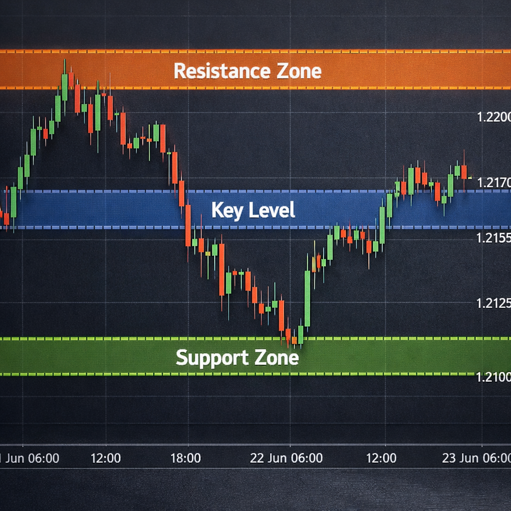
Step 2: Identify Key Support and Resistance Zones
Support and resistance act like invisible walls. When price hits one, it often pauses or reverses. To spot them, zoom out to a daily chart, then draw horizontal lines at recent peaks and troughs that held for at least two candles.
Next, drop down to a 1‑hour chart. If the same levels line up, you have a zone with strong confluence. This is where most high‑probability entries happen.
Imagine you are looking at EUR/USD. The daily chart shows resistance at 1.1050 and support at 1.0900. On the 1‑hour chart you see the price repeatedly bouncing off 1.0945. That 1.0945, 1.0950 band becomes a tight entry zone.

Once you have your zones, watch the price action around them. A bullish engulfing candle that closes above a support zone can be a green light. A bearish pin bar that closes below resistance can be a red light.
Why this works: Multi‑timeframe zone alignment is a recurring theme in professional checklists. It reduces the chance of entering on a fake break.
Bottom line:Draw zones on both daily and intraday charts; trade only when they line up.
Step 3: Use Momentum Indicators to Confirm Timing
Indicators are not the main driver, but they can add confidence. Choose a simple momentum tool like the 14‑period Relative Strength Index (RSI) or a Rate‑of‑Change (ROC) line.
When price reaches your support zone, look for RSI to be below 30 (oversold) and starting to rise. When it hits resistance, look for RSI above 70 (overbought) and beginning to fall. This shows the market is primed for a reversal.
Another quick test is a moving‑average crossover on a short timeframe. If a 5‑period MA crosses above a 20‑period MA right as price hits support, that adds a bullish push.
Remember, the indicator should only confirm what price action already tells you. If the candles show a bullish engulfing but RSI is still deep in oversold territory, you may want to wait a few minutes for the indicator to turn.
Why blend? The research shows that while many rules are indicator‑free, the few that use them rely on simple momentum checks, not complex oscillators.
Bottom line:Use one clear momentum signal to back up your price‑action entry.
Step 4: Apply Multi-Timeframe Confluence
Now bring the pieces together. Open a higher‑timeframe chart (like 4‑hour) to see the larger trend. Then switch to a lower timeframe (15‑minute) to fine‑tune the entry.
Here’s the process:
- On the 4‑hour chart, note the trend direction and the major support/resistance zones.
- Zoom into the 15‑minute chart and look for a price‑action pattern (e.g., bullish engulfing) that aligns with the higher‑timeframe bias.
- Confirm with your momentum indicator from Step 3.
- Place a pending order just above the swing low (for longs) or below the swing high (for shorts).
For example, the daily trend on GBP/USD is bullish. The 4‑hour chart shows a strong support zone at 1.2600. On the 15‑minute chart you spot a bullish pin bar that closes above 1.2605, and the RSI is climbing from 28. That’s a confluence of three timeframes and a momentum cue.
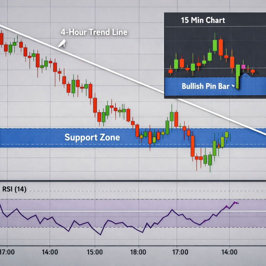
Why use this stack? A study from Rayner’s checklist shows that aligning zones across 4‑hour and daily charts boosts entry confidence.
According to the U.S. Securities and Exchange Commission, understanding market context across timeframes helps traders avoid impulsive entries that often lead to losses. SEC education on forex timing
Bottom line:Blend a higher‑timeframe bias with a lower‑timeframe entry pattern and a momentum cue.
Step 5: Execute with Risk Management Checklists
Even a perfect entry can turn sour if you ignore risk. Before you click ‘Buy’ or ‘Sell’, run through a short checklist.
Let’s say you are about to trade USD/JPY. Your analysis shows a bullish structure, support at 109.20, and RSI turning up. Before entering, you verify that the next economic release is not a major Bank of Japan announcement. You set a stop‑loss at 108.90 and a take‑profit at 109.80, giving a 1:2 risk‑to‑reward.
The IG article on timeframes notes that different trading styles need different stop‑loss widths. Scalpers use tight stops, while swing traders give the trade more room. Read the full timeframe guide
Why this checklist works: It forces you to pause, double‑check, and only then act. That pause is the secret behind the “kill‑zone” approach many pros swear by.
Bottom line:Run a risk checklist every time; it’s the last barrier before you press the button.
FAQ
What is the best time of day to look for entry signals?
The London‑New York overlap (8:30 , 10:00 AM ET) offers high liquidity and tight spreads. During this “kill‑zone,” price often respects key levels, making it a prime window for precise entries.
Do I need a lot of indicators to time my entries?
No. Research shows that half of the proven rules use no indicator at all. A single momentum tool like RSI or a short‑term moving‑average is enough to confirm what price action already tells you.
How can I avoid getting stopped out by news spikes?
Check an economic calendar before you trade. If a high‑impact release is scheduled within the next hour, stay out or tighten your stop‑loss. This simple habit prevents many surprise losses.
Should I trade on a 1‑minute chart?
Scalpers use 1‑minute charts, but the risk of noise is high. If you’re new, start with 15‑minute or 1‑hour charts where trends are clearer and false moves are fewer.
What’s the ideal risk‑to‑reward ratio?
A 1:2 ratio (risking $1 to make $2) is a common benchmark. It means you need to win only 33% of the time to break even, assuming you stick to your plan.
How often should I review my entry checklist?
Do a weekly review. Look at each trade that hit the checklist and note any deviations. Adjust the steps that caused confusion or missed entries.
Can I rely on automated alerts for entry timing?
Automation can help you spot the zones, but you should still confirm the price‑action pattern and momentum yourself. The human eye catches subtle candle nuances that bots often miss.
Is it okay to trade multiple currency pairs at once?
Yes, as long as you keep the total risk per day under your account limit. Diversifying can spread risk, but avoid over‑exposure to correlated pairs like EUR/USD and GBP/USD.
Improving your entry timing isn’t a magic trick; it’s a disciplined process. By studying market structure, marking strong support and resistance, confirming with a simple momentum cue, stacking timeframes, and locking in a risk checklist, you give yourself a repeatable edge. The steps above work for beginners and seasoned traders alike. Keep practicing, stay patient, and let the market come to you. For more deep‑dive lessons, check out FX Doctor’s other guides and keep building your own trading plan.