Ever felt like the market is whispering a secret language you just can’t catch? In this guide we’ll break down price action step‑by‑step, from reading candlesticks and spotting real breakouts to learning support, resistance and trend structure, so you can start trading with confidence right away.
We’ll walk through six usable steps, each packed with examples, tips and common pitfalls. By the end you’ll have a repeatable workflow you can apply to any forex pair.
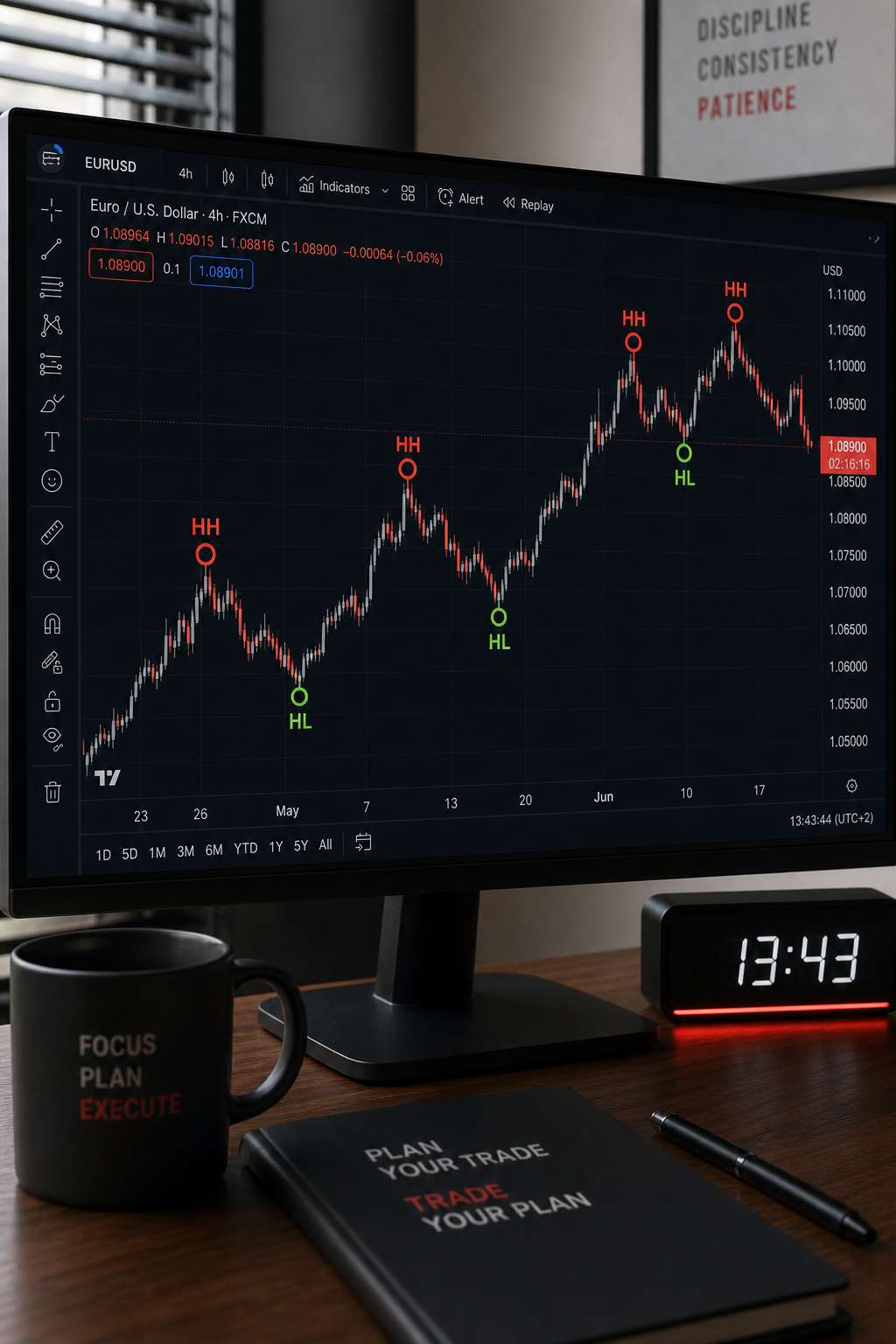
Step 1: Understand Price Action Fundamentals
Price action is simply the study of raw price movement on a chart, without relying on lagging indicators. The idea is that every candle, high and low already reflects the collective decisions of buyers and sellers. When you strip away the noise, the chart itself becomes a story of supply and demand.
According to Wikipedia’s definition of price action, the method focuses on patterns such as higher highs, lower lows, and consolidation zones. Those three structures, uptrend, downtrend, and range, are the backbone of any price‑action checklist. Think of them as the three lenses through which you view the market.
Why does this matter? Because if you can read the market’s story, you can anticipate where it might turn next. For example, a series of higher highs and higher lows signals bullish momentum, while lower highs and lower lows point to bearish pressure.
Here’s a quick way to spot the three structures on any timeframe:
- Draw a line connecting the most recent swing highs. If the line slopes upward, you’re likely in an uptrend.
- Do the same with swing lows. Rising lows confirm the uptrend.
- If both highs and lows are flat, the market is consolidating.
Most beginners miss the subtle “break of structure” moment, when price finally breaks a prior swing high or low. That break often precedes a strong move. Recognizing it early gives you an edge.
Imagine you’re watching the GBP/USD 4‑hour chart. The pair has made three higher highs in a row, but the last high is barely above the previous one. A break below that low would invalidate the uptrend and signal a potential reversal. That’s the exact moment you’d consider a short entry.
To practice, pick a currency pair and mark the swing points on a recent chart. Then watch for the next break of structure. Over a few days you’ll start to see the pattern repeat.
Keeping the market’s structure in mind also helps you avoid false signals that appear in choppy markets. When price is ranging, the same patterns that work in a trend often fail.
Remember, price action is a mindset, not a set of rigid rules. Stay flexible, and let the chart tell you what’s happening.

Step 2: Read Candlestick Patterns
Candlesticks are the visual language of price action. Each candle tells you who was in control during a specific period, buyers (green or white bodies) or sellers (red or black bodies). Certain shapes repeat often and act as signals for potential reversals or continuations.
The classic reference is Investopedia’s guide to price‑action candlestick patterns. It lists patterns like the pin bar, engulfing candle, and inside bar, all of which appear in seven reputable sources.
A pin bar is a candle with a long tail (or wick) and a small body. The tail shows where price was rejected. If a bullish pin bar appears after a downtrend, it suggests buyers are stepping in.
Here’s how to spot a bullish pin bar:
- The lower tail must be at least two‑thirds of the total candle length.
- The body should be small and near the top of the candle.
- Ideally, the candle closes above the midpoint of the previous candle.
Let’s walk through an example. On the EUR/JPY 15‑minute chart, price was sliding down in a clear downtrend. A candle formed with a tiny white body near the top and a long red tail extending well below the prior low. That’s a classic bullish pin bar. If you place a buy stop just above the high of that candle, you’ll catch the breakout if buyers take over.
Engulfing patterns work the opposite way. A bullish engulfing candle has a large white body that completely covers the previous red candle. It signals that buyers have taken full control of that price range.
It’s easy to misread a pattern when the market is volatile. That’s why we recommend confirming with the next candle. If the candle after a pin bar closes in the direction of the tail, the signal gains strength.
Below is a quick checklist for candlestick validation:
- Is the pattern located at a swing high/low?
- Does the next candle confirm the direction?
- Is the pattern on a timeframe that matches your trading style?
Practicing with historical data helps you internalize each shape. Many traders keep a “candlestick diary” where they log each pattern they spot and the outcome. Over time you’ll notice which patterns work best for the pairs you trade.
Step 3: Map Support and Resistance Zones
Support and resistance are the price levels where the market has historically turned. They act like invisible walls that keep price from moving freely. Identifying them early lets you set entry, stop‑loss and profit targets with confidence.
The methodology comes from the Price Action University guide on support‑resistance. The core idea is to look for clusters of swing highs (resistance) and swing lows (support) and draw a horizontal line through those clusters.
There are three ways to draw zones:
- Exact line:Connect two or more swing points that line up closely.
- Zone method:If swing points spread over a range of pips, shade the whole area as a zone.
- Dynamic zones:Use moving averages to approximate support/resistance that shifts with price.
Why zones matter: price often respects a zone rather than a single price. A break of a strong resistance zone can signal the start of a new uptrend, while a bounce off a support zone can confirm a continuation.
Let’s apply this to a real‑world scenario. The AUD/CAD pair has been trading between 0.9500 and 0.9700 for several weeks. By marking the 0.9500 low as a support zone and the 0.9700 high as a resistance zone, you create a clear range. If price pierces 0.9700 with strong volume, you could place a long entry with a stop just below the broken zone.
To avoid false breaks, watch the candle that breaks the zone. A single candle that closes beyond the zone but then quickly reverses may indicate a “fake breakout.” In that case, wait for a confirming candle or a retest of the broken level.
Traders also use the “multiple‑timeframe” trick: a support zone that aligns on the 4‑hour and daily charts is much stronger than one that appears only on a low timeframe.
Practice tip: Open a chart, pick a pair you like, and draw three zones, one on the 1‑hour, one on the 4‑hour, and one on the daily. Notice how the zones line up or diverge. That visual exercise builds intuition quickly.
Step 4: Analyze Chart Patterns & Trend Structure
Chart patterns are the next layer of price‑action analysis. They combine multiple candles into recognizable shapes that hint at future direction. The most common patterns are head‑and‑shoulders, triangles, flags, and rectangles.
Head‑and‑shoulders signal a reversal after an uptrend. The pattern consists of a left shoulder (peak), a head (higher peak), and a right shoulder (lower peak). The neckline, drawn through the troughs, acts as a trigger line, once price breaks below it, a downtrend often follows.
Triangles, ascending, descending, and symmetrical, are continuation patterns. In an ascending triangle, the upper trend line stays flat while the lower line rises, indicating buying pressure. A breakout above the flat top usually leads to a strong move.
Flags form after a sharp move (the flagpole). The price then consolidates in a narrow range, forming a parallelogram shape. The breakout opposite the flagpole’s direction signals the continuation of the original trend.
Here’s a usable walk‑through using a video example. Watch the chart below as the instructor identifies a descending triangle on the USD/CHF daily chart. Notice how the price respects the descending trend line, then bursts upward on the breakout candle.
When you spot a pattern, follow this checklist:
- Confirm the pattern’s geometry (equal highs, parallel lines, etc.).
- Look for a breakout candle that closes beyond the pattern’s boundary.
- Check the volume, higher than average volume adds confidence.
- Verify the pattern on a higher timeframe for stronger validity.
In the example, the breakout candle closed well above the triangle’s upper trend line with a 30% volume spike. That confluence made the trade high‑probability.
Remember that patterns can fail. That’s why we always pair them with other price‑action signals, like a pin bar at the breakout point.
Step 5: Integrate Indicators for Confluence
Pure price action works on its own, but many traders add a thin layer of indicators to boost confidence. The key is to use only lag‑free or minimally lagging tools that confirm what the chart already shows.
Two favorites are the Relative Strength Index (RSI) and the Average True Range (ATR). RSI measures momentum on a 0‑100 scale; values above 70 often mean overbought, below 30 mean oversold. ATR tells you the average price movement over a set period, helping you size stops and targets.
For example, imagine a bullish pin bar forming at a support zone on EUR/USD. If the 14‑period RSI is also below 30, that adds a “oversold” confirmation. You might then place a buy stop just above the pin bar’s high, with a stop‑loss a few pips below the zone using the ATR to size it.
Another common confluence tool is the Moving Average (MA). A 50‑period MA that slopes upward can act as dynamic support. When price bounces off that MA and a bullish candlestick pattern appears, the trade’s odds improve.
It’s easy to over‑load charts with indicators. Keep the layout clean: one or two simple overlays plus the candlesticks. The goal is to let the price speak, not the tools.
Below is a quick table that shows which indicator pairs work best with each price‑action signal.
Use this table as a quick reference when you build a trade plan.
Step 6: Build a Risk‑Managed Price Action Trade
All the analysis in the previous steps means nothing without solid risk management. A good trade plan defines entry, stop‑loss, target, and position size before you click the order button.
Here’s a step‑by‑step template you can copy:
- Identify the market structure (uptrend, downtrend, range).
- Mark the nearest support or resistance zone.
- Spot a confirming candlestick pattern at that zone.
- Check an indicator for extra confirmation (RSI, ATR, MA).
- Place a buy or sell stop just beyond the pattern’s high or low.
- Set the stop‑loss a few pips below (for longs) or above (for shorts) the zone, using ATR to size it.
- Calculate target using a risk‑reward ratio of at least 1:2. For example, if your stop is 20 pips away, aim for at least 40 pips profit.
- Determine position size so that the dollar risk never exceeds 1‑2% of your account.
Let’s illustrate with a live‑style example. The GBP/JPY 30‑minute chart shows a clear downtrend. The price pulls back to a resistance zone at 155.00 and forms a bearish engulfing candle that closes below the zone. RSI sits near 75, confirming overbought conditions. You place a sell stop at 154.80, a stop‑loss at 155.30 (50 pips risk), and a target at 153.30 (150 pips reward). Using a 1% risk rule on a $10,000 account, you would trade 0.2 lots.
Key to success is discipline: never move the stop after the trade is live, and never increase the size to chase a “sure win.” The math keeps emotions in check.
“The market will always be right; your job is to be right about the market.”
Finally, keep a trade journal. Record the setup, the rationale, the outcome, and any lessons learned. Over time you’ll see patterns in your own performance and can refine the process.
FAQ
What timeframes work best for price action trading?
Timeframe choice depends on your schedule and risk tolerance. Scalpers often use 1‑minute to 5‑minute charts, while day traders prefer 15‑minute to 1‑hour. Swing traders typically look at 4‑hour and daily charts. The key is to align the timeframe with the size of the moves you want to capture and to always confirm a pattern on a higher timeframe for added confidence.
Do I need any special software to trade price action?
p
No. Any charting platform that displays candlesticks and basic drawing tools will work. Popular free options include MetaTrader 4/5, TradingView, and cTrader. Just make sure the platform lets you draw swing points, trend lines, and add simple overlays like RSI or ATR.
How can I avoid fake breakouts?
Fake breakouts happen when price briefly crosses a level then reverses. To filter them out, wait for a confirming candle that closes beyond the breakout level, check for volume spikes, and see if the breakout aligns with higher‑timeframe structure. If any of those signals are missing, consider staying out or using a tighter stop.
Is it safe to trade without any indicators?
Pure price‑action trading is possible, but many traders add one or two low‑lag indicators for confirmation. Indicators like RSI, ATR, or a simple moving average add a layer of confluence without obscuring the chart. The goal is to keep the focus on price while using the indicator as a safety net.
What is the best way to size my positions?
Start by deciding how much of your account you are willing to risk per trade, most professionals use 1% or less. Calculate the distance between entry and stop‑loss in pips, then use the formula: Position Size = (Account Risk % × Account Balance) ÷ (Stop‑Loss in Pips × Pip Value). This ensures you never lose more than your predetermined risk, even on a losing streak.
How often should I review my price‑action strategy?
Schedule a weekly review. Look at all trades you made, note which setups worked and which didn’t, and compare them against the checklist you used. Adjust any step that consistently gave false signals, maybe you need a tighter zone or a different confirmation indicator. Continuous improvement is essential for long‑term success.
Conclusion
Price action trading boils down to reading what the market is saying, then acting with a disciplined plan. By learning market structure, candlestick patterns, support and resistance zones, chart patterns, and a thin layer of confluence indicators, you build a reliable edge. Add a strict risk‑management routine, keep a journal, and stay consistent, and the probability of profitable trades rises dramatically.
If you want a deeper look at building a full trading plan, check out A Usable Guide to Forex Price Action Trading. It walks you through each step with templates and real‑world examples you can start using today.