
Ever sat in front of a forex chart and felt the market whispering its next move? That moment when a single candle seems to tell a story is what draws many of us to price action trading.
But does that whisper turn into a clear signal, or are we just reading patterns into random noise? If you’ve ever wondered whether you’re chasing shadows or actually decoding market intent, you’re not alone.
Forex price action trading is all about reading pure price movement—candlesticks, support and resistance, trend lines—without relying on lagging indicators. By focusing on what the market actually does, you strip away the clutter and get a more immediate sense of supply and demand dynamics.
The appeal is simple: fewer tools mean fewer decisions, and each trade decision stems directly from what the chart shows. For aspiring traders looking to master fundamentals, this approach builds a solid foundation. Experienced traders appreciate how it meshes with multi‑timeframe analysis, letting them confirm a bias on higher frames before entering on a lower‑timeframe pullback.
Of course, the road isn’t without bumps. Many newcomers mistake a single breakout for a sustainable move, or they ignore the context of prior highs and lows. Over‑reliance on a single timeframe can also lead to false confidence. Recognizing these pitfalls early saves both capital and frustration.
In the pages ahead we’ll break down the core concepts you need: how to spot genuine swing highs, the role of candlestick formations, setting logical entry zones, and managing risk the way seasoned professionals do. We’ll also share practical checklists you can apply the very next time you open a chart, so the theory translates into actionable steps.
So, if you’re ready to move from watching the market to having a conversation with it, let’s dive in and explore the building blocks of forex price action trading together.
TL;DR
Forex price action trading cuts out lagging tools, letting you read pure market intent directly via candlesticks, support‑resistance zones, and multi‑timeframe bias in real time.
Use our step‑by‑step checklists to identify genuine swing highs, define logical entry zones, and control risk, turning each chart into a clear conversation for you.
Step 1: Understanding Price Action Basics
Ever stared at a candlestick chart and felt like the market was trying to tell you a secret? That gut‑feel moment is what price action is all about – you’re listening to pure price, no lagging fluff.
First things first: price action is simply the movement of price itself. Every swing, every high and low is a piece of the story. When you strip away indicators, you’re left with three things that matter most: the candle shape, the support‑resistance zones, and the time‑frame bias.
Read the candle, read the market
Imagine a bullish engulfing candle on a 15‑minute chart. It’s not just a green bar; it’s a surge of buying that overpowers the previous sellers. That tells you demand is stepping in, at least for the moment. On the flip side, a long‑legged doji can signal indecision – the market is pausing, waiting for a push.
So, how do you turn that visual cue into a trading edge? Start by asking yourself: “Is this candle confirming a larger trend, or is it a lone wolf?” If the same bullish pattern repeats near a known support zone, you’ve got confluence.
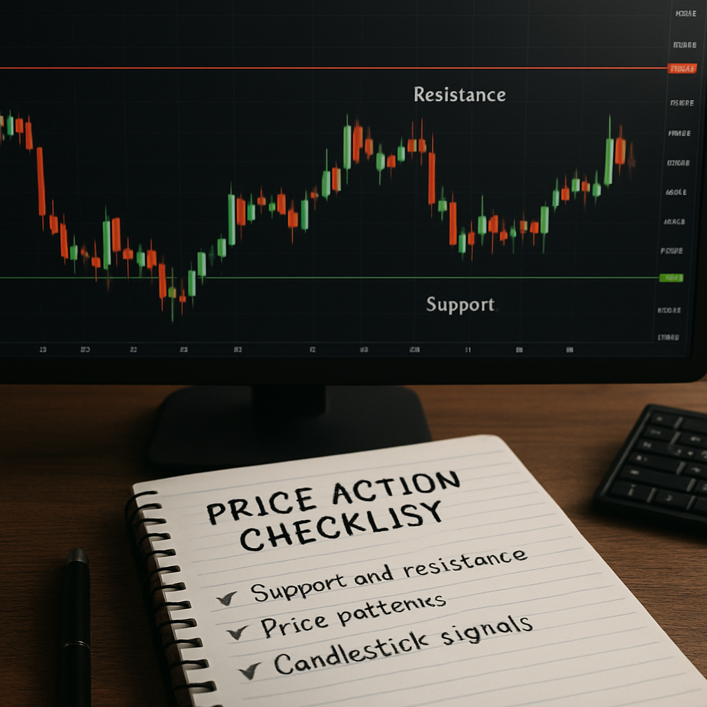
Support and resistance – the market’s memory
Support is where price has historically bounced; resistance is where it’s stalled. Think of them as invisible walls the market respects. When price approaches one of these walls, watch the candles closely. A sharp rejection – a pin bar or a hammer – often signals a reversal.
We like to mark these zones on multiple time‑frames. A daily swing high might act as resistance on a 4‑hour chart, giving you a clearer entry point. This multi‑time‑frame bias is the backbone of disciplined price action trading.
Does this feel a bit abstract? Let’s make it concrete. Suppose you’re looking at EUR/USD on a 1‑hour chart. You notice a clear resistance line at 1.1200, formed over the past two weeks. The price pulls back to 1.1150, and you see a bullish engulfing candle right at that level. That combination – a known resistance turned support plus a strong bullish candle – is a textbook entry signal.
Notice how the video breaks down exactly that scenario, step by step. Watching it helps you visualize the process rather than just reading about it.
Putting it together: a quick checklist
Before you place a trade, run through these three questions:
- What does the current candle say about market sentiment?
- Am I near a significant support or resistance zone?
- Does the higher‑time‑frame bias support the direction I’m considering?
If you can answer “yes” to all three, you’ve got a solid price‑action setup. If not, step back – the market is often louder than we think.
One resource that many traders find helpful for visualising these concepts is Maris Graph. Their charting tools let you draw zones and see candlestick patterns in real time, which aligns perfectly with the price‑action approach.
Finally, remember that price action isn’t a magic wand. It’s a skill you develop by repeatedly observing how price reacts to its own history. Treat each chart like a conversation – listen, ask questions, and respond only when the market gives you a clear answer.
Practice these basics on a demo account, note which setups work for you, and refine the checklist. Over time the “whispers” become louder, and you’ll start spotting high‑probability moves without the clutter of extra indicators.
Step 2: Identifying Market Structure
When you stare at a chart, the first thing you need to ask yourself is: “What is the market doing right now?” That simple question unlocks the whole idea of market structure – the skeleton that holds price action together.
In forex price action trading, market structure is nothing more than a series of swing highs and swing lows. If those points are moving higher, you’re in an uptrend; if they’re moving lower, you’re in a downtrend. When the price simply bounces between two flat levels, you’ve got a consolidating range.
Step‑by‑step: Map the structure
1️⃣ Open the daily or 4‑hour chart. Draw the most recent three swing highs and three swing lows. Use a thin line so the chart stays readable.
2️⃣ Check the direction. Higher highs + higher lows = bullish bias. Lower highs + lower lows = bearish bias. No clear direction? You’re likely in a range.
3️⃣ Zoom down to the 1‑hour or 15‑minute chart. See if the lower‑timeframe respects the same swing points. If a 15‑minute pull‑back respects the daily swing low, you’ve got confluence – a stronger entry zone.
4️⃣ Validate with volume. A spike in volume on a swing high that fails to break higher suggests sellers are stepping in; the opposite is true for a swing low with volume surge.
Real‑world examples
Take the EUR/CHF pair in early 2026. On the daily chart, the price formed higher highs at 1.0900, 1.0955, and 1.1010, while swing lows rose from 1.0800 to 1.0845. That clear uptrend gave us a bullish bias. Dropping to the 30‑minute chart, a bullish pin bar formed right at the 1.0845 low with a 60 % volume bump. The trade‑setup respected both the daily structure and the short‑term confluence.
Contrast that with the AUD/JPY mid‑year range. The daily chart showed a flat corridor between 80.10 and 80.80 for several weeks. When we zoomed into the 15‑minute view, price kept ping‑ponging inside that band, and volume stayed muted. Trying to go long or short inside the range without a breakout would have been a dice roll.
Why structure matters
Because it tells you where the market is likely to respect you. A break of a swing high in a downtrend often signals a reversal, while a break of a swing low in an uptrend can be a trap. Understanding this helps you avoid chasing false breakouts – the very pitfall many beginners fall into.
Pro tip: always compare the current structure with the previous one. If you notice a shift from higher highs/lows to a flat range, you’re probably transitioning from a trend to a consolidation phase. Adjust your trade‑size and risk accordingly.
Actionable checklist
- Identify the last three swing highs and lows on the daily chart.
- Determine trend direction (up, down, or range).
- Zoom to a lower timeframe and look for price respecting those swing points.
- Confirm with a volume spike at the swing point.
- Mark entry, stop‑loss, and position size – keep risk ≤2%.
If you need a deeper dive into how these concepts fit into a broader trading plan, check out our Comprehensive Forex Trading Guide for Beginners and Beyond. It walks you through the whole process from market structure to trade execution.
For traders who juggle analysis with daily life, consider time‑boxing your chart reviews. The Pomodoro technique can keep you laser‑focused, and FocusKeeper shows you how to batch tasks effectively. A disciplined routine reduces emotional fatigue and improves decision‑making.
Finally, if you manage client accounts or run a small advisory service, proper record‑keeping becomes essential. A platform like ClientBase helps you stay compliant and organized, letting you concentrate on the market rather than paperwork.
By consistently mapping market structure, you turn the chaotic noise of price action into a readable story. That’s the foundation for every profitable trade you’ll take.
Step 3: Reading Candlestick Patterns
When you finally spot a swing zone, the next question is: what is the candle actually saying? That’s where candlestick patterns become your conversation starter with the market.
Why patterns matter in forex price action trading
In pure price action you’re not looking for a magic indicator; you’re looking for the market’s own “voice.” A pattern that repeats near a support or resistance level adds weight to the bias you already identified.
Think about it this way: a hammer at a recent low is like a buyer whispering, “I’m still here.” A bearish engulfing at a resistance line is the market shouting, “Time to pull back.” The louder the whisper, the more confident you can be.
Core patterns you should recognize
We’ll focus on the ten candlestick patterns most traders rely on, as outlined by Trading Setups Review. The list includes doji, marubozu, harami, engulfing, piercing line / dark cloud cover, hammer / hanging man, inverted hammer / shooting star, morning/evening star, three white soldiers / three black crows, and the hikkake.
Each pattern falls into one of three families: basic sentiment (doji, marubozu), reversal (harami, engulfing, hammer, etc.), and continuation (three soldiers, hikkake). Knowing which family you’re looking at tells you whether you should expect a pause, a turn, or a push.
Doji – the indecision candle
A doji’s open and close are virtually identical, forming a cross. It signals market congestion. If you see a doji right at a swing high, treat it as a warning flag – the next candle could swing the other way.
Engulfing – the strong reversal
When a bullish candle completely swallows the previous bearish body, the market is trying to reverse. In an uptrend, a bullish engulfing at a pull‑back low often precedes a short‑term rally. The opposite holds for a bearish engulfing at a resistance peak.
Hammer and hanging man – same shape, different context
Both have a small body near the top and a long lower shadow. In a downtrend the hammer suggests buyers stepped in; in an uptrend the hanging man warns of potential weakness. Confirmation comes from a follow‑up candle that closes beyond the hammer’s high (for bullish) or below the hanging man’s low (for bearish).
Three White Soldiers – the momentum burst
Three consecutive bullish candles, each opening within the prior body and closing near a new high, signal strong buying pressure. If this formation appears after a prolonged dip, you can treat it as a “green light” for a longer‑term entry.
Step‑by‑step: reading a pattern in real time
- Zoom to the timeframe where you see the swing zone (usually 15‑minute or 1‑hour).
- Identify the candle that touches the zone.
- Check the candle’s shape against the pattern list above.
- Validate with volume – a spike of at least 30 % above the 20‑period average adds conviction.
- Place a tentative entry a few pips beyond the pattern’s breakout point (above the high for bullish, below the low for bearish).
- Set a stop‑loss just beyond the opposite side of the pattern’s wicks.
- Size the position so risk stays ≤2 % of your account.
Let’s walk through a live example. On the EUR/GBP 1‑hour chart on 12 May 2026, the price had been sliding toward a 0.8600 support line. A bullish engulfing candle formed right on that line, and the volume bar showed a 45 % surge. By entering a few pips above the engulfing high and stopping just below the low of the prior red candle, a trader could have captured a 60‑pip move as the pair bounced back to 0.8665.
Another case: the USD/JPY 15‑minute chart on 3 June 2026 displayed a hanging man at a 149.30 resistance. The next candle closed below the hanging man’s low, confirming the bearish signal. A short entry just below 149.30 with a stop above the high of the hanging man would have protected the trade while allowing a 40‑pip profit as the pair drifted down to 148.90.
Pro tip from the FX Doctor playbook
Always cross‑check the pattern with the higher‑timeframe bias. A bullish hammer on a 5‑minute chart is much more reliable when the 4‑hour chart is already in an uptrend. This double‑layer of confluence reduces the chance of getting caught in a false breakout.
Finally, keep a simple journal of every pattern you trade – note the pair, timeframe, pattern type, volume level, and outcome. Over time you’ll see which patterns work best for your style and which ones you might want to ignore.
Step 4: Applying Support and Resistance Zones
Now that you can spot swing highs and lows, the real magic happens when you turn those lines into actionable zones. Imagine the market as a hallway – the floor is support, the ceiling is resistance. When price bumps into either surface, it either bounces or breaks, and that moment is where you decide what to do.
Identify the zone you’ll trade
First, pull up the daily or 4‑hour chart and draw the most recent three swing points. Those are your horizontal anchors. Zoom into the 15‑minute or 1‑hour view and watch the price approach one of those lines.
Do you feel a little tug when the candle’s wick kisses the zone? That’s often a sign the market is testing the level. If you’re unsure whether the zone is still valid, ask yourself: has the price respected it at least twice in the last few sessions? If yes, you’ve got a decent foothold.
Validate with confluence
Support and resistance rarely act alone. Look for a confirming candlestick pattern – a hammer, engulfing, or pin bar – right at the zone. Add a volume spike (30 % above the 20‑period average) and you’ve got a solid “yes” from the market.
Need a quick refresher on what counts as a support or resistance level? learn the basics of support and resistance levels – the article breaks it down in plain language.
Set entry and stop‑loss
For a bullish scenario, place a buy order a few pips above the high of the confirming candle. That tiny buffer protects you from a false bounce. For a bearish setup, set a sell order a few pips below the low of the candle.
Stop‑losses should sit just beyond the opposite side of the zone. If you bought at a support zone, the stop goes a few pips below the support line; if you sold at resistance, the stop goes a few pips above the resistance line. This way, even if the market decides to break, your risk stays limited.
Check trade‑management basics
Once the trade is live, monitor two things: price staying inside the zone and any new volume spikes. If price pierces the zone and holds, consider scaling in or moving your stop to break‑even. If the price reverses sharply back into the zone, it may be time to exit early – protecting capital beats chasing a losing move.
So, what should you do next? Grab a chart, draw three swing points, and practice the three‑step routine: zone, pattern, volume. The more you repeat, the more instinctive the process becomes.
| Zone Type | Typical Candle | Entry Hint | Stop Placement |
|---|---|---|---|
| Support | Bullish engulfing or hammer | Buy a few pips above candle high | Just below the support line |
| Resistance | Bearish engulfing or shooting star | Sell a few pips below candle low | Just above the resistance line |
| Breakout | Strong three‑white‑soldiers or three‑black‑crows | Enter on the breakout candle close | Opposite side of the breakout zone |
Remember, the goal isn’t to predict every move – it’s to give yourself a clear, repeatable framework. When you treat support and resistance as zones rather than exact lines, you give the market room to breathe and yourself room to manage risk. That’s the essence of reliable forex price action trading.
Step 5: Building a Simple Price Action Trading Plan
Ever felt like you’ve got the right candle pattern but no clear idea what to do next? That moment of hesitation is exactly why a concise trading plan matters – it turns a fleeting insight into a repeatable edge.
In forex price action trading we’re not chasing every wiggle on the screen; we’re looking for a handful of high‑probability setups that fit inside a framework we trust. Below is a step‑by‑step “playbook” you can write on a sticky note and bring to every chart session.
1️⃣ Define Your Market Bias
Start on the daily or 4‑hour chart. Ask yourself: are we seeing higher highs and higher lows, lower lows and lower highs, or a sideways corridor? Write the bias in plain English – “bullish bias on EUR/USD” or “range‑bound bias on GBP/JPY”. This simple sentence becomes the north‑star for every lower‑timeframe trade.
Why does this help? Because a bullish bias tells you to look for long‑side candles at support, while a bearish bias flips the script. If you ignore the higher‑timeframe context, you’ll end up fighting the market’s own momentum.
2️⃣ Mark Your Entry Zone
Zoom into the 15‑minute or 1‑hour view and draw the most recent swing low (for longs) or swing high (for shorts). Treat the line as a “zone” rather than an exact price – give it a few pips of breathing room. The zone is where you’ll wait for the confirming candlestick.
For a concrete example, picture EUR/USD holding around 1.0800 on the daily chart. On the 1‑hour chart you see a bullish pin bar that touches the 1.0800 zone, and the volume bar spikes 35 % above the 20‑period average. That confluence is a green light to consider a long entry.
3️⃣ Set Entry Rules
Once the pattern forms, place a pending order a few pips beyond the candle’s high (for buys) or low (for sells). This “buffer” protects you from false spikes that often occur right after the candle closes.
Make a note of the exact price level – e.g., “Buy limit @ 1.0825”. If the price never reaches that level, you simply stay out and wait for the next setup. No chasing, no emotional panic.
4️⃣ Determine Risk Parameters
Here’s where the plan becomes a safety net. Calculate your stop‑loss a few pips beyond the opposite side of the zone – maybe 1.0780 for the EUR/USD long example. Then size the position so that the dollar risk never exceeds 2 % of your account equity.
If you’re unsure about the exact pip distance, use the “ATR‑based” rule: stop‑loss = 1.5 × ATR(14) on the same timeframe. This adds an objective measure and removes the guesswork.
5️⃣ Write a Mini Checklist
Before you click “Enter”, run through a three‑item checklist:
- Bias matches higher‑timeframe trend?
- Candlestick pattern confirmed with volume spike?
- Stop‑loss placed beyond the zone and risk ≤2 %?
If any answer is “no”, step back and wait for the next clear signal. Over time this habit becomes second nature, and you’ll find yourself skipping the analysis paralysis that so many beginners fall into.
Want a deeper dive into why price action traders favour pure price movement over lagging indicators? QuantInsti’s price action guide breaks down the philosophy and gives additional pattern ideas you can add to your toolbox.
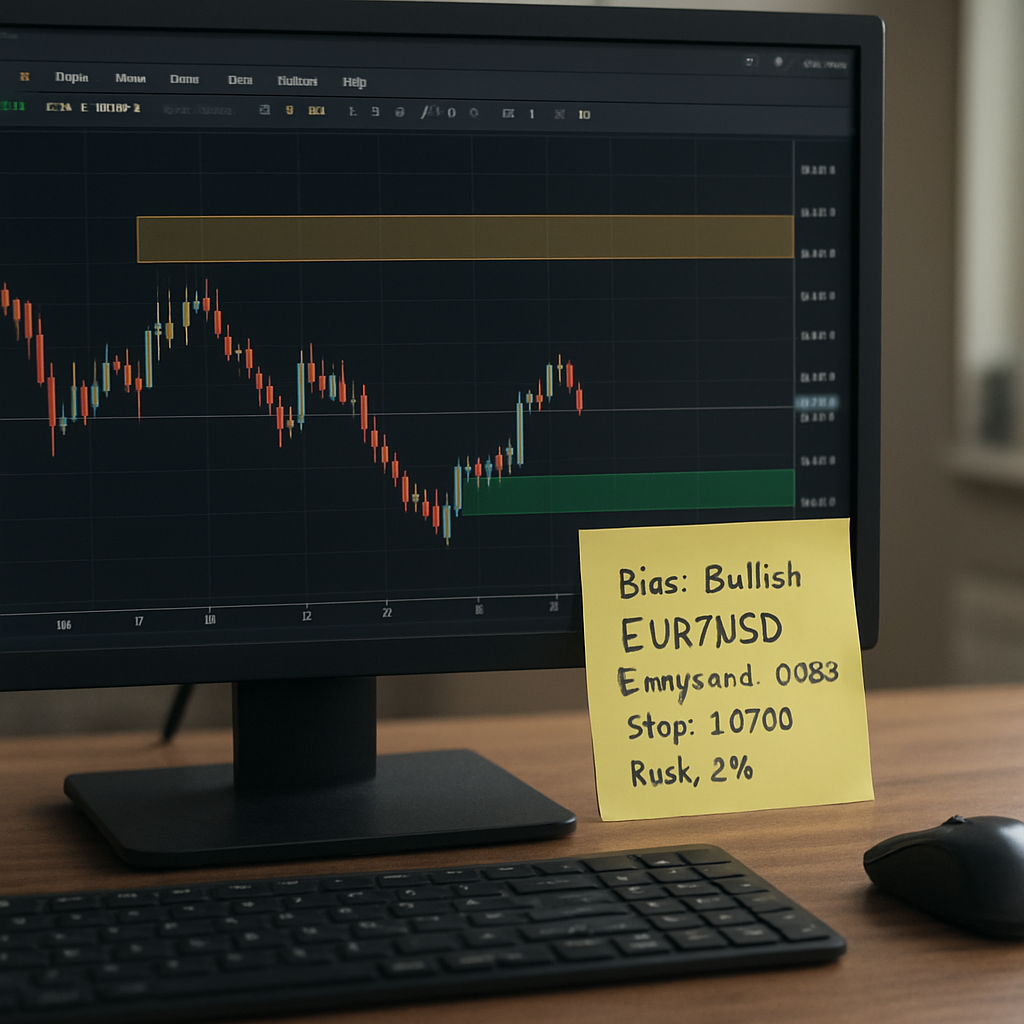
Putting it all together, the plan looks like a short paragraph you could paste into a notes app:
Bias: Bullish EUR/USD (daily) Zone: 1.0800‑1.0820 (support) Entry: Buy limit @ 1.0825 (above pin bar high) Stop: 1.0780 (below zone) Risk: 2 % (position size calculated) Checklist: bias ✓, pattern ✓, risk ✓
When you see the same structure repeated on multiple pairs, you’ll start to feel the market’s rhythm instead of fighting it. That’s the real power of a simple price action trading plan – it gives you confidence, consistency, and a clear exit if the market decides to turn.
Conclusion
We’ve walked through the building blocks of forex price action trading, from spotting structure to turning a candle into a trade plan.
So, what does all this mean for you right now? It means you can stop guessing and start listening to what the market is actually saying.
When you combine a clear bias, a well‑drawn zone, and a confirming pattern, the decision‑making process becomes almost automatic. That little routine is what separates consistency from chaos.
Remember the checklist we built: bias, entry zone, pattern, volume, risk. If any piece feels shaky, pause and re‑evaluate – the market will still be there tomorrow.
For aspiring traders, start by applying the plan to one pair a day. For experienced traders, look for confluence across multiple timeframes to tighten your edges.
Does this feel doable? Absolutely. The tools are simple, the steps are clear, and the only thing you need is discipline to stick to the process.
Take the next step: open your chart, draw those three swing points, and watch the next candle speak. That’s the essence of forex price action trading – a conversation you can actually follow.
Keep a tiny journal of each setup – note the pair, timeframe, pattern and outcome. Over time you’ll see which zones work best for your style and refine the process without over‑complicating it.
FAQ
What is forex price action trading and how does it differ from indicator‑based methods?
Forex price action trading is simply reading the raw movement of currency pairs on a chart – candles, swing highs, swing lows and the zones they create. Instead of relying on lagging tools like moving averages or oscillators, you let the price itself tell you where buyers and sellers are stepping in. The result is a cleaner decision‑making process that reacts in real time, which many traders find less noisy and more intuitive.
Do I need a lot of time on my screen to use price action effectively?
Not necessarily. The core routine we teach at FX Doctor fits into a short, focused session: check the higher‑timeframe bias, draw three swing points, then zoom to a lower timeframe for a confirming candle and volume spike. For aspiring traders juggling a day job, a 15‑minute review each morning can be enough to spot high‑probability setups. Consistency beats marathon chart‑watching every hour. Stick to the checklist and you’ll see the process become almost automatic.
How can I identify a reliable entry zone without over‑complicating the chart?
Start by marking the most recent three swing highs and lows on the daily or 4‑hour chart – those become your support and resistance zones. Then drop down to the 1‑hour or 15‑minute view and look for a candle that touches or slightly breaks the zone, ideally with a volume spike of 30 % above the recent average. Place a pending order a few pips beyond the candle’s high (for longs) or low (for shorts) and you’ve got a disciplined entry.
What role does volume play in price action, and can I trade without it?
Volume acts like a confidence meter. When a bullish pin bar appears at support and volume jumps, it suggests genuine buying pressure rather than a fleeting wobble. If volume is flat, the candle could be a false signal. While you can still trade without a volume indicator, adding that extra data point reduces the risk of chasing noise, especially in fast‑moving sessions like the London open.
How do I manage risk when trading purely on price action?
The simplest rule we advocate is to set your stop‑loss just beyond the opposite side of the zone you’re trading. Then size the position so that the dollar risk never exceeds 2 % of your account equity. Using the ATR (Average True Range) on the same timeframe can help you define a realistic stop distance, ensuring you’re not clipped by normal market jitter.
Can price action be combined with other analysis techniques?
Absolutely. Price action provides the foundation – bias, zones, and candle confirmation. From there you can layer multi‑timeframe confluence, trend‑line breaks or even a subtle moving‑average filter if it adds clarity for you. The key is to keep any additional tool secondary; the market’s raw story should always remain the primary driver of your trade decision. When the confluence lines up, you’ll notice tighter entry zones and fewer whipsaws, which is exactly what both aspiring and experienced traders crave.